Friday, 22 November 2013

Second Draft


Supervisor feedback:
  • Inter titles are needed, for example cast names and other information.
  • Some scenes are a bit rough and need altering or removing.
  • There needs to be some sound at the end.
Personal view:
I have taken the information on board, some scenes will be removed and replaced by intertitles and cast details. Although I can use the sound from the clips as a soundbridge to aid the dynamics of the trailer.

Supervisor Feedback:
  • The main image needs re-sizing, there is still room for one more sell line.
  • The text under the main sell line is hard to read, I may need to change the colour of the font
Personal view:
I have taken the feedback on board and I will re size the image, I agree there is only room for one more sell line. However I like the font colour but I will experiment with different types of stroke.

Wednesday, 20 November 2013

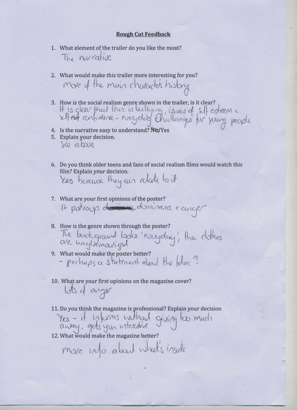
Rough Cut Feedback


To develop my products effectively I needed to conduct audience feedback for my media products, I did this in a range of different ways. Firstly, I constructed a range of questionnaires for my primary audience. This gave them a series of direct questions relating to my media products. Secondly I asked audience members within my class to give me feedback on post it notes. I told them to comment on what needed improving on all of my products. Lastly I asked my class supervisor for feedback. From these three different sources of data I have managed to see some similarities. These problems will be addressed.


Trailer Feedback
Audience:
When looking at my trailer feedback I found some very apparent similarities. From the positive side a majority of answers said the genre was represented well in my trailer and that my narrative was good. The negative aspect of my trailer was said to be mainly the lack of dialogue, many members of my audience said this. This also ties in with another popular grievance, there needs to be another part of the narrative. When I film the complicating action in the next few days this gives me the challenge of getting crucial dialogue for my trailer. This can be done through scenes in which my protagonist communicates with Dean, the character that helps my main character re build himself. This will solve the problem with the lack of narrative and will also ensure that there is more dialogue. I will also make sure that I record a voice over to introduce the trailer and to catch the attention of the viewer. Hopefully with the the filming of the next scenes I will be able to address these issues and satisfy the audience.  
Supervisor: 
My class supervisor also gave me feedback on my trailer. Again it was very similar to my audience feedback. I need to add more dialogue and sound to my trailer. This can be done through filming my complicated action. I can also search for more copyright free music and sound effects, I could also attempt to create my own soundtrack.

Poster Feedback 
Audience:
Again the positive aspect about my poster was that the genre was being clearly represented. However the main problem with my poster was that there is a lack of content. To improve this I will add more information and forms and conventions of real media products. For example quotes and cast information. One member of my audience even suggested creating a statement about my film, another suggested the addition of more quotes. I will make sure I add further professional content onto my film poster. To combine my products I 
could also put a quote on from my magazine, this would link my media products together.
Supervisor:
Again the feedback was very similar to my audience feedback. There is a lack of professional content on my poster, again quotes and cast information were suggested.

Magazine Cover Feedback
Audience:
Many people said that my magazine looked professional and the layout was good. However I need to improve it by adding more sell lines and advertise more content. This can be done with the addition of another image maybe taken from a still from my film. I could create more content related sell lines for my magazine featuring British films, actors and directors.
Supervisor:
The feedback was similar, more content was needed to appeal to the audience. I also needed to make the cover look professional by utilizing more space. 

Wednesday, 6 November 2013

Rough Cuts


My rough cut trailer shows the basic structure for my future trailer. To represent my genre I have used tints to alter the darkness of the shots. Social realism is a dark genre and adding a dark tint helps emphasise the depressing locations. Making some scenes black and white helps make them more dramatic, this technique has been adopted from the Dead Man's Shoes trailer. The scenes of abuse in the past are made black and white. The trailer follows my narrative, in the begining the characters are introduced and the life of the main character comes alive when his abuse is shown. Towards the end the character transforms himself and seeks revenge. The use of diolouge is short and adds to the atmosphere of the trailer. My next step is to film and add more footage, this will give the trailer the main bulck of diologue. It will also explain the process of the main character taking revenge, this will build tension later in the trailer. I also need to create a soundtrack in garage band, this will add to the atmospheric feel of the trailer. After effects will also be used to create a collection of text shots that will help explain the narrative.


This film poster helps represent the narriative of the film as the reader can see that the film involves three characters. The use of the character with the sledgehammer suggests that the film will have violent elements. The poster also represents the genre by the use of English housing in the background. To complete my poster I need to add text, for example reviews from magazines and and the names of actors and directors. I also want to add a white boarder to make my poster look more asthetic.


So far my magazine cover has a good structure. The text is aligned in the correct manner and the image is central overlapping my masthead, this technique was used in my insperation text. The use of a skyline helps adverise further content.To improve this I need to add more sell lines and improve the bottom part of my magazine. This can be done by adding more text.


Friday, 11 October 2013

Production Company Logos


I created this production company logo to make my film look more professional. From my research I found that most trailers feature production compnany logos. I have researched some production companies that produce social realsim film's. Warp films produced Dead Man's Shoe's and This is England. It also produced other British films such as Submarine which I have taken some inspiration from and Four Lions. I wanted to create a production company that was professional and sounded like it produced British films. I named my production company 'Grey Stone Productions' for a number of reasons.The 'Grey Stone' part of the name represents the tradition of dry stone walling which is famously British; it was used to mark field boundries and territory. This strongly relates to the theme of social realism as both things are notoriously British. The word 'Grey' has connotations of saddness and blandness. This is strongly related to my genre as social realism represents the hardship and sadness behind working class British life. Therfore I thought Grey Stone Productions sounded very fitting.

I created this production logo by downloading a font from dafont.com that looked like solid stone. I then created a Photoshop document and used the font. I made sure each of the words in the title were the same size and layered on-top of eachother. This represents a dry stone wall. Next to this I used an image of an actual dry stone wall to make the logo look eye catching. I could now apply the production compy logo to other media products such as my poster. This then helped brand identity. 


This is used at the end of the trailer to inform the viewer of the name of the film for future reference. The font is also the same as on my poster which helps create an effective brand identity. This will add to the professionalism of my finished trailer. It also features the age rating of the film so the audience is aware.

Thursday, 10 October 2013

Magazine Development


So far my magazine cover has a basic structure. I have used the font 'HelveticaNeue' for my sell lines as the font looks bold and professional; it's also similar to the magazine cover I have taken inspiration from. Empire magazine is a reputable magazine and gives off a professional feel; it does this by using bold conventional fonts. I am trying to create this effect on my magazine cover. Being a magazine that represents the British film industry and British talent, I have included other arts such as music. Music plays a key part in social realism films as it helps influence subcultures, which are often shown in my genre. Thefore I have used Iggy Pop and his connection to Trainspotting in the sky line. The front cover has been created using a Photoshop document. I now feel confident with my Photoshop skills from my AS production. The font 'PulpFiction' has been used for my masthead. This is because the font was very bold and noticeable. The font works well with the text as it makes the word 'BritFlick' look strong and powerfull. This will hopefully attract my desired audience.

NOTE: Throughout the development of my products I will colate a number of screen shots of the production Process and present them in a Prezi towards the end of my ptoduct development

Monday, 7 October 2013

Poster Development


These are my first ideas for my poster. I have used stills from my trailer footage to create the bottom poster and my test shot for the top poster. I am confident that using stills will be effective, this has been done in the piece I have taken influence from. To create these examples I used Photoshop. I have used the font I selected in my font research and applied it it to a poster sized photoshop document. To achive the effect on my images I have desaturated the images to make them black and white. On the first poster I simply used the quick selection tool to move the character from the test shot to the Photoshop document. The second poster requred more technical ability. I created a background gradient and tried to blend the dark colours into a lighter red. I also had to make the end of the main charxters hammer into a seperate layer and put it infront of the main image. This makes the poster look more dimensional. I feel the images I have used represent the genre well sue to the strong emotion, however I will have to wait for audience feedback further into the development process.