Wednesday, 25 September 2013
Magazine Cover
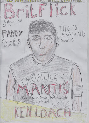
My magazine front cover will feature the main character central to the page. This again helps give away narrative information, the film has to be about this character. The biggest sell line is the name of the film which is located under the main image. This will draw attention to the center of the page. The use of the title 'Brit Flick' suits my genre and target audience. Social realism films aim to keep the British film industry alive, therefore calling my magazine BritFlick is an accurate representation of an example magazine cover. The use of a skyline helps draw attention to extra content in the magazine. The use of smaller font size helps expand on the sell line without giving too much away, it also keeps the reader interested. These techniques have also been used on the example front cover to the left. The use of the primary colours, red, yellow, black and white make the sell lines and titles stand out on the page and accompany each other making my magazine cover look professional.
Subscribe to:
Post Comments (Atom)


No comments:
Post a Comment